As, Not For: Dethroning our Absolutes curated by Jerome Harris Explores the Work of Black Graphic Designers by A.F. Oehmke
Today, it is impossible to look at any cultural industry and not see a push for diversity, equity, and inclusion. Every day, schools, museums, and cultural institutions across the country are creating new exhibitions, programs, and initiatives in hopes of cultivating diverse students and audience members. The Maryland Institute College of Art (MICA) is no exception.
MICA’s graphic design department, as with the field and institution, is historically white. As, Not For: Dethroning our Absolutes is the first curatorial attempt for designer and MICA Teaching Fellow, Jerome Harris, and the school’s graphic design department in addressing the exclusionary aspects of the field. Harris’ exhibition not only highlights Black designers but also offers a pedagogical alternative to the ways in which the department currently teaches graphic design.
I met with Harris for drinks to discuss his exhibition, teaching at MICA, and being a Black graphic designer. The following is a condensed edited version of our conversation.

What was the impetus for this exhibition?
There is a whole body of work out there that is being neglected and should be visible and included in the history of graphic design. For example, W.E.B Du Bois’ infographics, which are not included in the study of data visualization, to my knowledge. In addition, the representation of people of color in the graphic design industry is really low (see the 2017 design census results), and I totally suspect this is because of the lack of visible diversity. Archie Boston, an exhibited designer, said in an interview with AIGA, “It is important for young designers to have role models of their so-called ethnicity. This gives them the feeling, ‘If he or she can become this, so can I.’”
What does it mean that this exhibition is at MICA?
Baltimore is 64% Black, and that is not reflected in the student population at MICA. This may be cheesy, but given the chance that one Black Baltimorean youth might stumble upon this show and simply consider a graphic design career, I’d be happy. I’ve included a column in the exhibition poster which chronicles the acceptance of one of the first African-American students to MICA, Howard M. Gross, in 1895, published in the Afro-American Newspaper.
What about its placement in a throughway to the graphic design department?
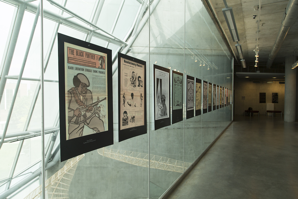
Resources were limited, and I had to use the space that is allocated to the graphic design department to exhibit the work. I’m happy with the space, though. It really has a presence in the hallway, so I hope it inspires curiosity about the designers exhibited. Ideally, I would have had the exhibition on the first floor, where people walk into the Brown building. If this were the case, I would have absolutely included the fact that Eddie and Sylvia Brown, the individuals whose money paid for the construction of the building, are Black.
How did you select the work for the exhibition?
I started with Buddy Esquire’s work, and another party flyer designer, Phase 2. When I was in grad school, we were required to do a research project on a graphic designer of our choice. I chose Esquire, who designed works 1–7 in the show. I felt a connection with Buddy because I too was a self-taught designer who got my start making party fliers. His were on letter-sized paper in the 80s, mine on 4×6 UV coated cardstock in the early 2000s. I found a few interviews with Esquire on hip-hop websites in the deep dark corners of the internet. Cornell University graduate student Amanda Lelonde wrote a scholarly article on him, and I found a few images of his work on the internet. Other than that, there was nothing else. Frustrated, I wanted to know if this was the case for other Black designers. Well, it was.
My entire research process felt incidental and accidental, like that of an old-school detective trying to construct a crime narrative using a link chart. Once I came to a point where I had a sufficient amount of information and work with, I wanted to display a range of work that shared a spectrum of Black culture and identities. The show is broken up into four sections: Parties & Protests, Advertising & Commerce, Black Data, and Musicality. While each section is split up by the purposes for which the work was made, they each give you an entry point to the lives and times that the designers lived in.

The first thing I thought of when I saw the exhibition was, “Oh, he designed meta-posters.” You took all of these designs of different sizes and different materials and put them on 24×36 backgrounds that are all black. The posters also have information about the work and function as labels. Can you talk a little bit about the format?
When I go to museums a lot of times, there is work of all different sizes, of all different textures. They are actually present. You can access them directly. I couldn’t achieve that with this show, as I couldn’t borrow work from the archives. The second consideration I made was that if I produced physical reproductions of the work to scale, the show would have been tiny. I could have done this, but I wanted to dramatically increase the scale so that patrons would focus on the formal qualities of the work, as well as accentuate the archival textures of the reproductions.
I wanted you to look at it and think about how and when it was made. This was necessary for me. Also, as a conceptual act, it was important because this is important. Like, Look at this! Like that big ass Snoop Dogg album art was probably 4×4 inches originally. It was like me being a hype-man for my own show through my decisions to scale up and unify the works container.
I was going to make small didactic placards to sit beside the posters. Somewhere along the line, I was like “I’m just going to put it on the poster.” I also feel like what this does is show that I’m still utilizing refined traditional typographic techniques, because the show in itself is not a rejection of the status quo of graphic design.
The posters in themselves, as you said, are meta-posters. They are showing the work, floating in the black void of a 24×36 poster. They are telling you about the typographic style of Robert Bringhurst and Beatrice Ward. They in themselves are a manifesto, calling for the integration of the design history that we know, and a history waiting to be discovered. Sharing the same scale allows them to work together—I say “in solidarity” on the curatorial statement—for this purpose.

Graphic design is notoriously white and male. While everyone included is Black, your exhibition is very dominated by men. Can you speak about the contributions Black women have made to the field?
No shade. I’m in touch with Michelle Washington who is a Black graphic designer based in New York. I asked if I could use some of her work, and she was very helpful and supportive of my endeavor, but is also very protective of her work because she has a legacy of her own. She doesn’t like giving out too much information because she does not want to be used. I asked her to connect me to Cheryl D. Miller, who went to MICA and is a pretty big graphic designer. Miller grew up in DC and went to RISD. She left RISD because one of her family members was sick. MICA was close to home so she finished her degree here. She didn’t seem to into the idea of risking her legacy either.
There were two other designers I was trying to get to through Washington, because she knew them personally, and they all fell through. I understand people want to protect themselves and their work. Especially when you have a certain amount of success you may want to keep a tight circle. It’s real. I didn’t have this problem with Art Sims or Cey Adams, though, both of whom I spoke with directly. So, to each their own.
Maybe I can get their work to exhibit in the future because Black women are the shit, and I need them in this show. It is frustrating.

A lot of hip-hop musicians needed designers to create album art and posters and flyers for events. How did music cultivate Black designers?
One of the best parts of this journey was meeting Cey Adams. I went to his studio in Brooklyn, and we had a long conversation. He basically just showed me all of his work because he was very happy to just be like “Yo, look at what I did.” And he was like, “Nobody gives a shit.” You know what he said when I walked in his studio, I was like, “You don’t understand how happy this makes me. To see you here and me here. And just know this is a clear path for me at some point.” And he was like, “Well thank you for giving a shit.” That is what he said. And you know, it made me a little sad, that he thanked me for caring. Now I forgot the question….
How hip-hop and graphic design influenced each other over time.
I’m just going to tell you what Cey Adams told me third party. He grew up in New York. He had friends that needed event flyers, who also needed album art. He was a painter, he went to School of Visual Arts. He was a graffiti artist but he also trained as a painter at SVA. He started doing graphic design not even knowing about modernism or the Bauhaus, or any of that…Just going for it. And Def Jam picked him up. He co-founded Def Jam’s in-house graphic design studio. He actually is the authority on early hip-hop album art from like 1985–2000. All of the hits released through Def Jam went through his hands, for which he made iconic album covers.
I’m not even sure how to answer this question, though. For me, the work of Cey Adams and Buddy Esquire are the blueprint of Hip-Hop represented through design. I haven’t seen much effort into further advancing their ideas or methods. I will mention Nick Gazin at Vice celebrating Buddy, and The Get Down on Netflix using his style in the opening of the show. So, for me, not much cross-pollination has happened. It’s never too late to start, though. I think by including these designers in some graphic design history books and lectures parallel to their white contemporaries like designers like Paula Scher, Neville Brody, David Carson, and Paul Rand, this can happen. Young designers can advance Hip-Hop design aesthetics with the promotion of them by educators and the design community at large.

A lot of the meta-posters are for events. Out of all the events advertised, which one would you most like to go to?
I think it was 1980, I wasn’t even born yet. It is the Days of Christmas flyer. There are a couple of different reasons why I picked it. So the Day of Christmas flyer, for me, was a fucking typographic masterpiece… There are no images on it. It has nothing to do with Christmas…no Christmas trees, no stars, no cross. It is just straight up typography. It is beautiful. I love it. That is one reason.
The second reason is that it took place over four days. So the first day is like an MC battle, the second day is like a breakdance battle. But every day over the four days of Christmas different things were happening. I would have loved to see that live. I guess that the last reason is that my best friend passed away last year and his birthday was Christmas. If I could have attended the event with a guest it would have been Nico. I would have loved to share that moment with him on his day.
 As, Not For poster designed by Jerome Harris
As, Not For will be up through September 30th in the Bronze Gallery located on the third floor of MICA’s Brown center.
Images courtesy of Jerome Harris.