Alexandra Barbera on the Met’s New Location in the Breuer Building, formerly The Whitney
Every time I walk by the Breuer building I’m reminded of a game of Tetris. The building juts out on 75th and Madison, like a piece that has accidentally fallen and is impossible to disregard. I have walked by the iconic structure countless times and each time, it’s been the Whitney Museum, which existed there from 1966 to 2014.
So, when I recently got the opportunity to preview the space as the new Met Breuer, which features modern and contemporary art from the Met’s collection, I couldn’t wait to witness the Breuer’s transformation. Walking up Madison Avenue, I almost expected the distinct angles of the building to look different.
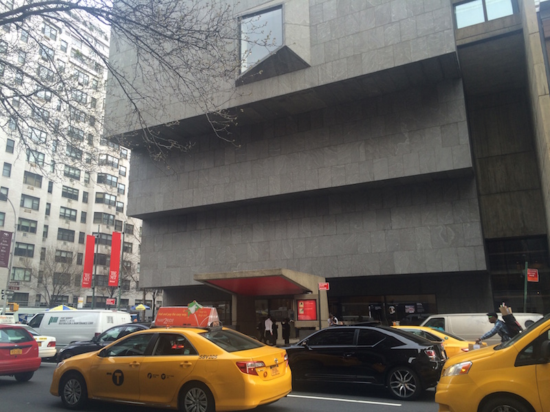
As I crept up the block, however, everything looked the same. There was no line, no big signs, and no red carpet; only a couple of thin, red Met banners which had been hanging at the corner of 75th street for sometime already.
I found the lobby of the building was surprisingly familiar as well. There were a few things switched around – the (nearly completed) gift shop would be located upstairs on the fifth floor instead of the bottom floor, which would be home to an uptown branch of the restaurant Estela – but these changes were subtle enough to start me reminiscing about my past history with the place. I thought back to my many visits, seeing Alexandar Calder’s Circus on a lower school field trip and more recently, seeing Jeff Koons’ stack of sponges on a hot summer’s afternoon. I had a weird sense of déjà vu, as if I had been there and experienced the place in a past life.
I started my reintroduction at the current top of the building (the fifth floor is not yet open) with Unfinished: Thoughts Left Visible (March 18 – September 4, 2016), which fills up the 4th and 3rd floors. The exhibition displays art left unfinished by artists either intentionally or unintentionally.
The first two rooms were brimming with both abstract and classical art by Picasso and Cezanne. As a pupil of Cezanne, Picasso learned about “the power and possibility of not finishing – or not appearing to finish – works of art” and about the significance of indecision. Some paintings I hardly noticed were unfinished while others reminded me of those elaborate paint-by-numbers projects I never had the energy to finish.
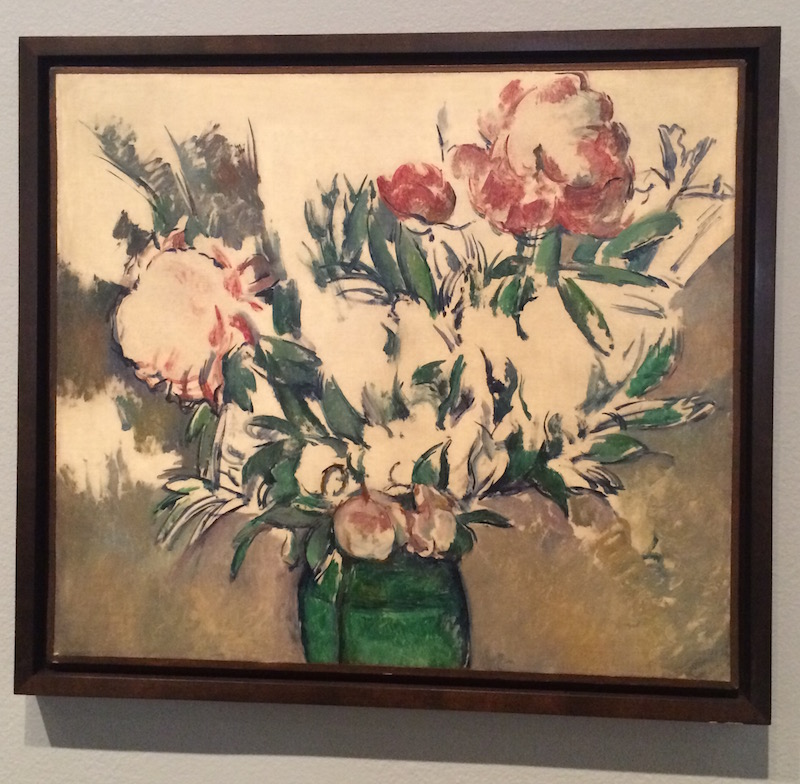 Cezanne’s Bouquet of Peonies in a Green Jar, c. 1898
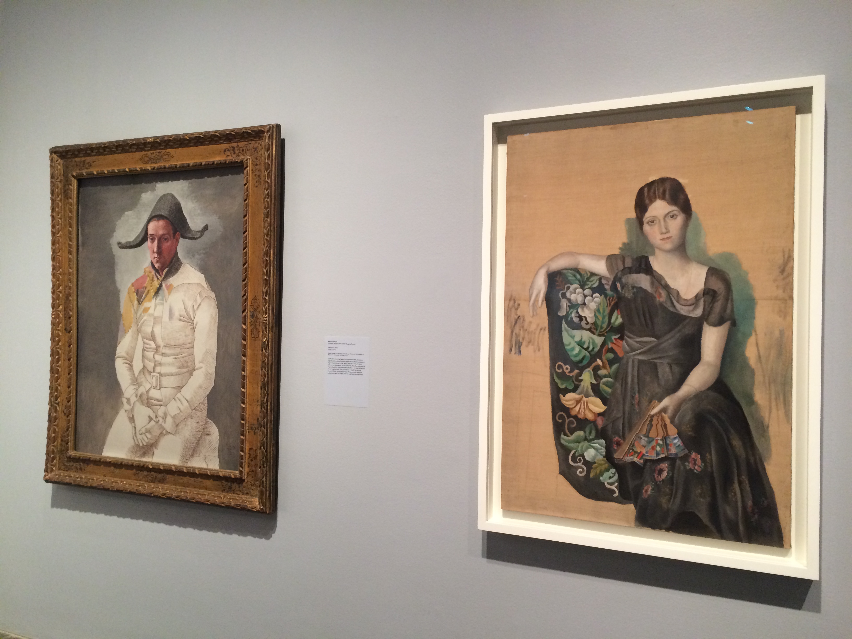 Pablo Picasso’s Harlequin (1923) and Portrait of Olga in an Armchair (1918)
Walking into the next room, I realize that Andy Warhol must have felt similarly. His “Do It Yourself (Violin)” (1962) is a semi-finished paint-by-numbers project that is part of a series. The piece’s label suggests that Warhol intended it to appear as though two different colorists were working on the paint-by-numbers and through this, he playfully encourages viewers to participate in the piece’s completion. By filling in numbers both precisely and sloppily, Warhol praises artists’ unique processes in spite of clear-cut instructions.
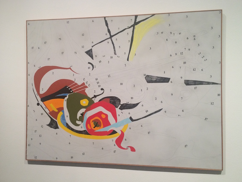 Andy Warhol, Do It Yourself (1962)
The other side of the room also focused on numbers, but more specifically, on the idea of infinity, which both fascinated me and made me anxious. There were two seemingly plain canvases, one white and one grey, but after a closer look, I realized they were full of faint numbers.
The artist, Roman Opalka, was “intent on visualizing the continuum of time [and] began to count to infinity”, reaching a conclusion only with his death in 2011. I was oddly satisfied by this piece but wished there was some way for visitors to continue his counting. Between this and “Do It Yourself,” I felt a strange urge to participate in the art – either in continuing Opalka’s counting or filling in Warhol’s paint-by-numbers. I thought these could have been interesting opportunities to have visitors contribute to the exhibition and participate in the space in some way.

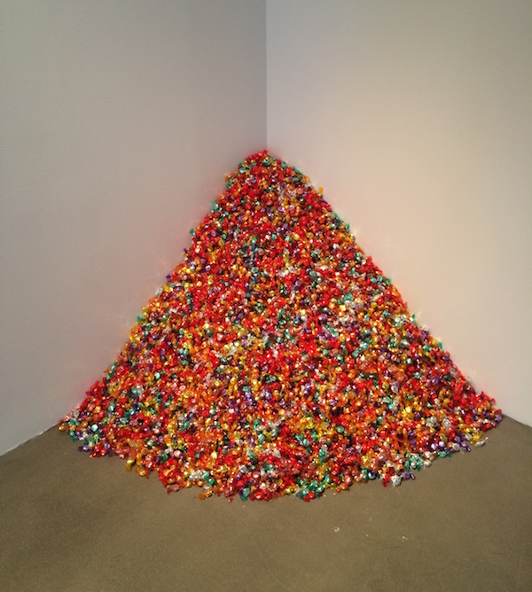
Then I heard the beeping. There was a rather loud and annoying beep coming from behind me, which accompanied one of the pieces having to do with infinity. I moved on to the next room, which had more of my kind of art: candy.
The 175 lbs pile of candy in the corner was an installation by Felix Gonzalez-Torrez symbolizing the ideal weight of his late partner, who was a victim of AIDS. Other museumgoers stood around the candy uncomfortably, unsure of whether or not the instructions on the wall reading– “Please take one” — were some type of setup. I, on the other hand, didn’t hesitate to stick my hand in and grab the shiny candies. This type of participation in the art was exactly what I was looking for; I continued on, happily sucking on a strawberry sweet.
There was a classic Mondrian with colored tape clearly in the middle of being replaced by painted lines, which was a reminder that these pieces are glimpses into artists’ creative thought processes. Looking at this painting I was randomly reminded of watching great ballet dancers.
The grace and simplicity of their movements and techniques make it easy to take the thought process and hard work behind them for granted. I thought of the number of times Mondrian must have moved these pieces of tape around and how fulfilled he felt as soon as their intertwining finally clicked for him.
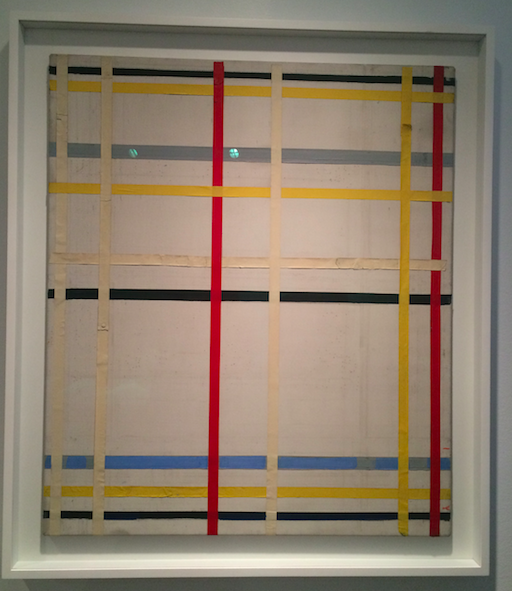 Piet Mondrian, New York Unfinished 2 (1941)
The next room featured one of the most memorable walls of the exhibit for me – Willem de Kooning’s “Woman, I” (1950-52), Marlene Dumas’” The Painter” (1994) and Maria Lassnig’s “You or Me” (2005) – Dumas and Lassnig were two female artists out of only a handful present in the exhibition. “You or Me” gave the illusion that the subject of the painting, Lassnig, was deciding to shoot either the viewer or herself. The isolation of Lassnig in the center of the empty canvas captures the psychological tension of the piece perfectly, as she is zeroed in on us and focused on making a decision.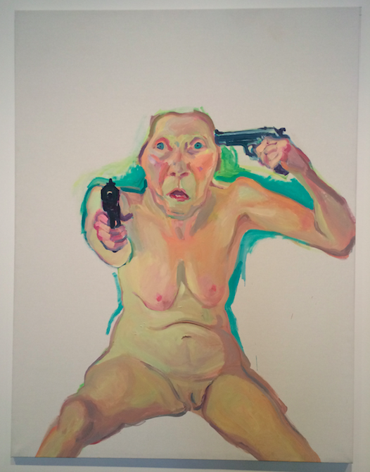 Maria Lassnig’s You or Me (2005)
The lower floor of the exhibition was noticeably darker (in terms of lighting) and filled with older works, many of which had religious subjects such as almost-finished paintings of Jesus and his disciples. Most of these paintings seemed unintentionally unfinished with either floating heads lacking bodies, or completely painted bodies missing faces. I was interested to notice which artists worked from the outside of the canvas in and vice versa.
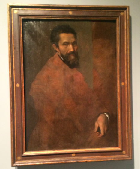 Daniele de Volterra’s Michelangelo Buonarroti (c.1544)
 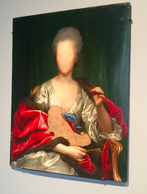 Anton Raphael Mengs’ Portrait of Mariana de Silva y Sermiento, Duquesa de Huescar (1775)
I was stopped in my tracks by a magnificent Klimt. The splashes of flowers taking shape around the sketched subject of Klimt’s “Posthumous Portrait of Ria Munk III” was a necessary exhale and relief of color. I felt as though I was looking at the skeleton of one of his signature shimmering gold pieces. Ironically enough, after reading the information about the painting on the wall next to it, I learned that the piece was actually bookended by the subject’s suicide and the death of Klimt himself.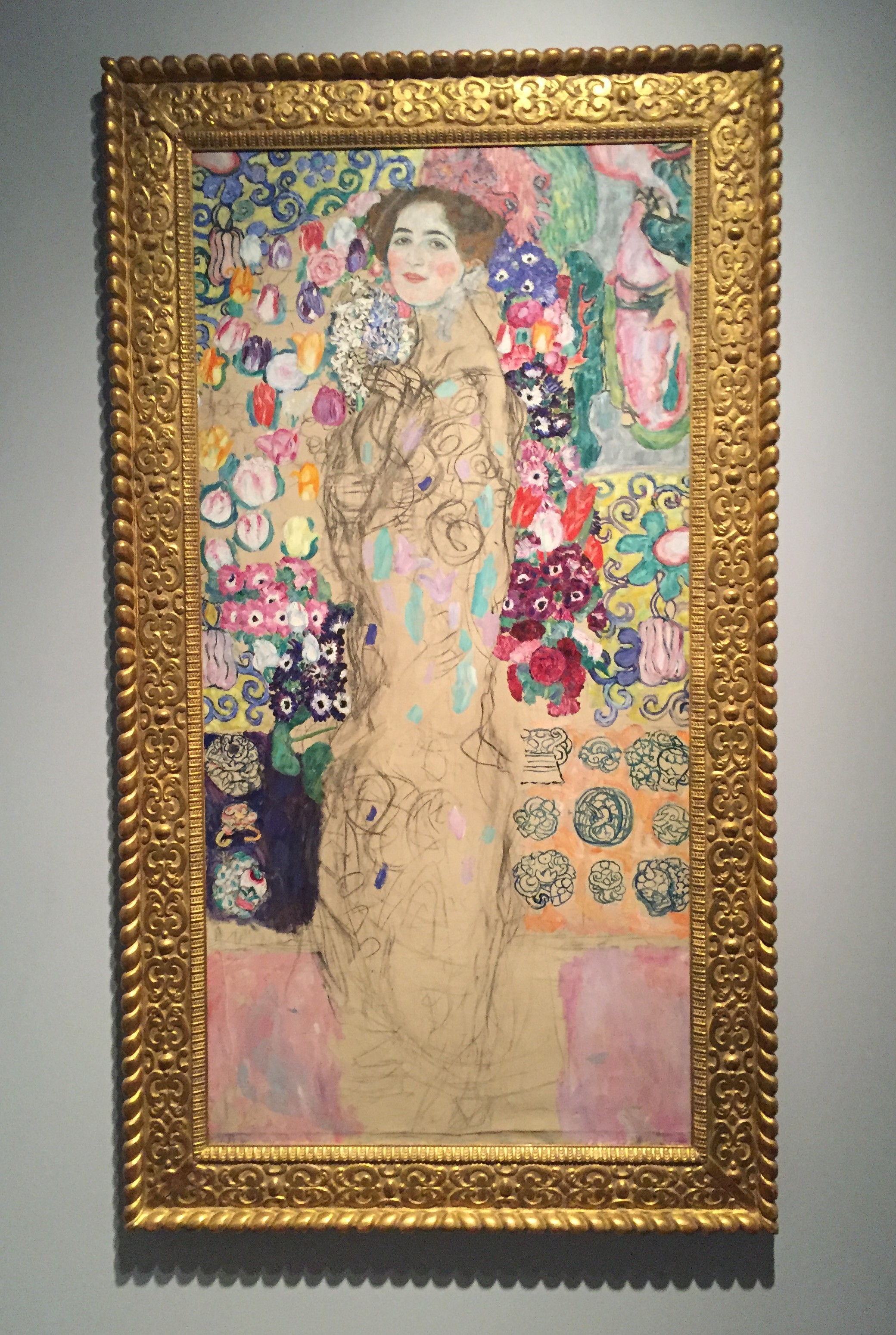
Looking at certain paintings, like this one, which were left unintentionally unfinished, I felt as though some of their artists must be turning in their graves thinking that their work is being displayed half done. But, these paintings give us the opportunity to appreciate their methods and techniques in a completely different way. They leave a lot more room for our own imaginations by engaging our minds to think up what the “complete” painting would look like.
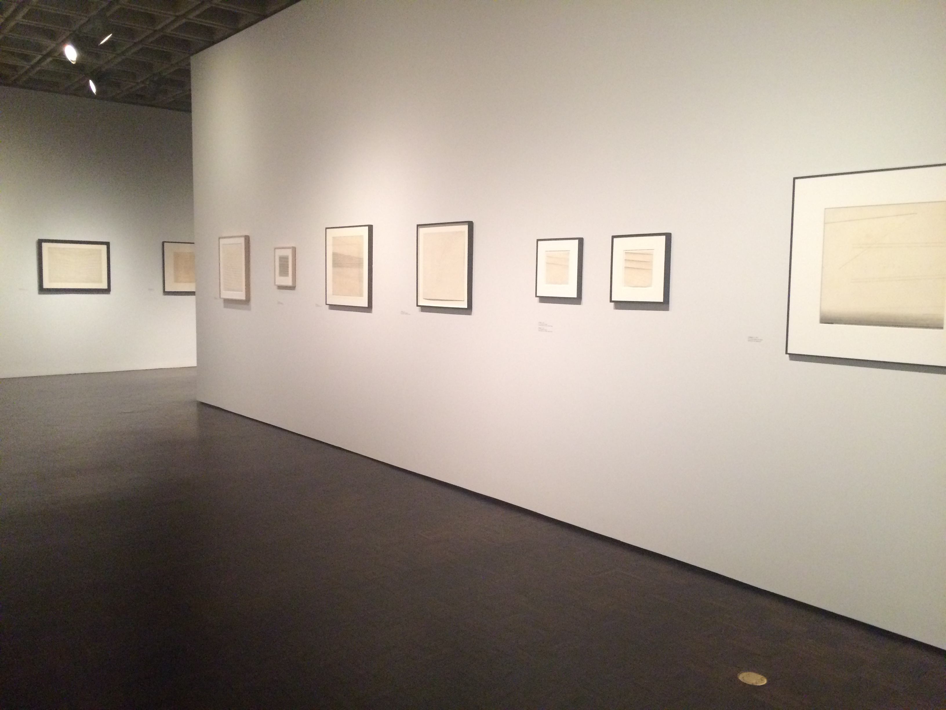
As I continued to the second floor to a retrospective on Nasreen Mohamedi, I realized that ending my visit with her sketches wasn’t exactly a smart or fair thing to do. Her minimalist style – featuring mostly different combinations of angled lines made with pencil on paper – made her sketches seem more unfinished than the paintings upstairs. Although I did think her work complemented the architecture of the building, I didn’t think the two exhibitions worked well together, but perhaps this is because I should have started from the bottom up, ending with the masters upstairs.
 Regardless, walking out of the Mini Met I was really satisfied by the abundance of art and felt I needed to go back to fully appreciate the overwhelming number of unfinished masterpieces from the 15th century to the 21st century. The frequently rotating installations and performances in their Lobby Gallery (which I didn’t get to experience) will also bring me back to the Breuer soon, as will the new restaurant and the outdoor garden area on the ground floor, especially when spring finally decides to show up in New York.
That said, the space still feels like the Whitney to me. Trying to create a new identity in a previously used building is not an easy thing to do, especially when dealing with a beautiful landmark like the Breuer building.
I thought of a quote by Yoshio Taniguichi, who designed the MoMA. In an interview about the museum’s design, he said, “If you raise a lot of money, I will give you great, great architecture. But if you raise really a lot of money, I will make the architecture disappear.” Although I was initially conflicted about the lack of physical change within the building, this quote reminded me that it’s really not about the walls the art hangs on, but rather the art itself.
The fact that the Museum now has more space to show off its unparalleled collection is something I am beyond excited about. With their two properties on Fifth Avenue and Upper Manhattan overlooking the Hudson River, the Met certainly knows how to make a space iconic and classic. Working with an already iconic building, I think it is only a matter of time before the Breuer becomes fully transformed into the Museum’s third hub of creativity and culture.
Author Alex Barbera is an avid reader, writer, traveler, eater and movie watcher from New York.