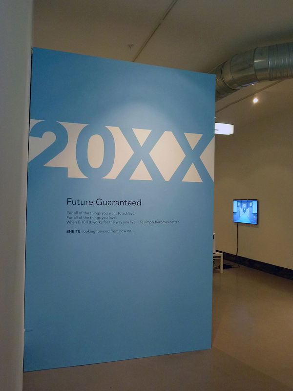
Joshua Haycraft: “20XX Future Guaranteed”
Ian MacLean Davis: Since 2007, Joshua Haycraft’s artistic practice has focused almost exclusively on BHBITB, an installation project which serves as satire of contemporary corporate/spiritual/consumer culture. Prior to pursuing his MFA, Haycraft trained as an industrial designer, and in BHBITB he applies his acute awareness of design, materials, and language into a collection of artifacts, propaganda and interactive media, which promise an optimistic and vague future of no specific value, if only we sign on the dotted line.
Haycraft is a snake-oil salesman of the highest order, hiding behind the organizational persona of the unintelligible BHBITB (Is it a phonetic? Is it a secret acronym? It sure is a mouthful…) to condense many technological, cultural and philosophical references into a product from a perfect world, as filtered through the utopian ideals of Modernism. If that seems like a lot to tackle, it is. It’s not that complicated though, as we implicitly understand the language of BHBITB because it is conveyed through friendly branding and retro-futuristic aesthetics, which have been completely integrated into familiar media consumer culture. Ben, what do you think of all this?
Benjamin Andrew: I definitely agree that everything in the show feels familiar, which isn’t anything against Haycraft, but rather because he so perfectly echoes the visual language of science fiction and advertising. I often feel like product design and software interfaces are just pulling pages from the history of Science Fiction films, and I think BHBTIB really points out how shallow and omnipresent that aesthetic has become. The clean white surfaces and molded plastic forms in the exhibition are exciting to me because I feel like I’m walking onto the set of Star Trek or Minority Report (or an Apple store), but, like the best Sci-Fi they become a little ominous after looking closely.
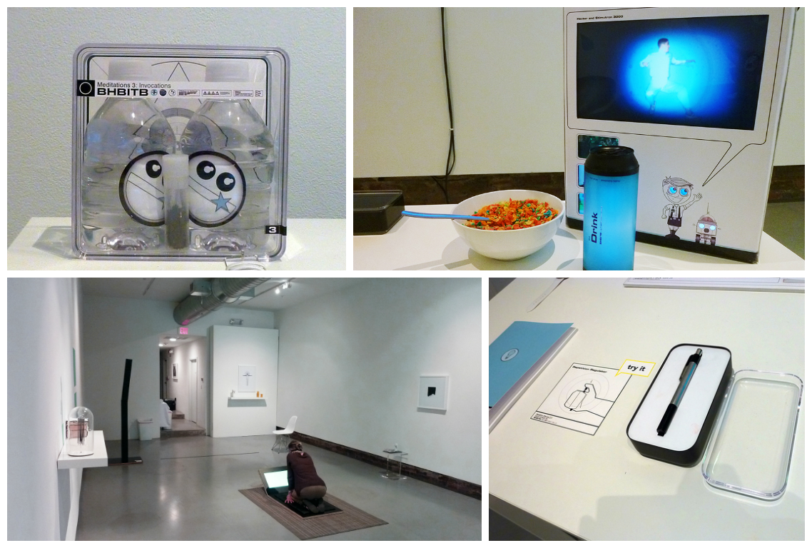
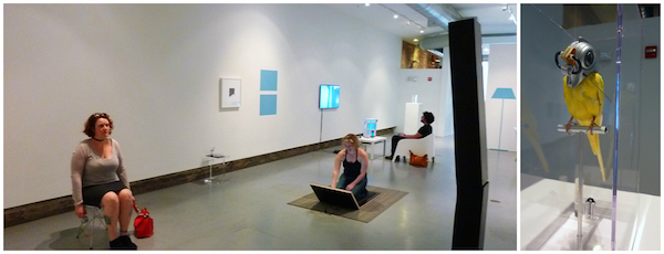
I got really enthusiastic about investigating the desk installation in the gallery, only to end up feeling tricked and captured by some bureaucratic system. I sat down in the vaguely round chair to take a close look at the materials organized so neatly on the Spartan white desk. This faux-office was surrounded by a living room and other home furnishings in the gallery, which seemed to outline the home of the future.
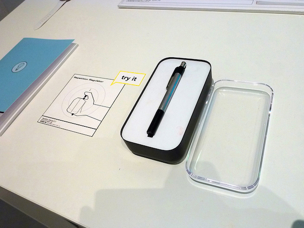
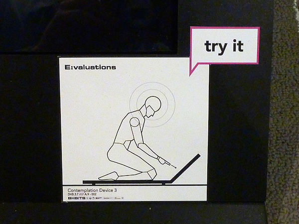
The desk was covered in well-designed handouts and books (Promotions, edition of three, 2013); ample reading material that I ignored in favor of a modified pen labeled with a sign that said “try it.” All of the interactive work in the show included delightful little signs showing figures executing the actions related to each piece; the illustrations felt like airplane safety manuals and perfectly fit with the overall aesthetic of the show.
Anyway, the drawing instructed me to click the pen, but when I did, I found that the pen had no writing tip and was simply a counting device meant to structure my soulless future-time, just like the single-digit clock on the wall and the virtual soccer game on the nearby TV.
IMD: To me, the desk-set you described is the most inviting aspect of the “office” installation, but at the same time very anonymous. It’s pre-fabricated, pre-assembled, and shrink-wrapped. In a more generic setting, there’s nothing suspicious about a set of notebooks featuring clear directions and consistent design. In a gallery, visitors are expected to question preconceptions and the most benign objects are those they should perhaps be most suspicious of.
As you mentioned, adjacent to the desk set there is a 70’s-era black and white television showing a digital soccer game. (BHBITB TV: Ball Pass 20XX, vintage television with digital single channel video, 2014). The viewpoint of game is shown from a mid-range distance, following a half-dozen or more players on-screen at a time. Viewed through the vintage TV tube, with color removed, the generic character designs are rendered indistinguishable from each other. In color, in the video game’s original presentation, it is designed to reinforce the importance of teamwork and competition. In removing the color, and therefore our ability to distinguish sides and individuals, the game-play dissolves into an illustration of groupthink and the futility of conflict.
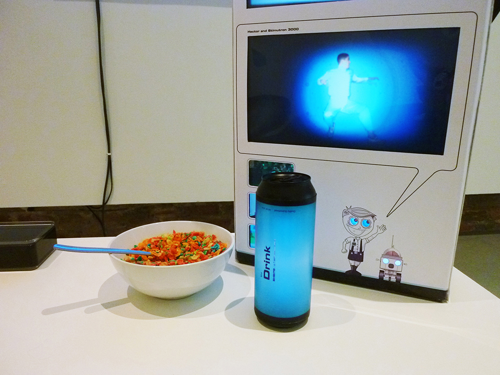
My favorite element of the show is the interactive video game included in the living room installation you mentioned (Meditation Station 1.0, 2014.) In this mini-living room, visitors are able to sit down at a common injection-molded plastic table, which presents a video-game console and controllers, a cereal box, a blue water-bottle marked “Drink” and a bowl of Fruity Pebbles cereal. Instead of the expected friendly cartoon graphics, the box presents animated videos on its surface.
Selling lifestyle ideals has long been an element of marketing breakfast convenience foods, going back to the early 1960’s. (For example in “Wheaties: The Breakfast of Champions”) Haycraft uses the cereal box to sell the lifestyle messages of BHBITB, however vague they may be. There is dissonance in the read of this object: we know Fruity Pebbles are bad for us, yet we are still reassured by the symbolic value of the box and flakes. This aesthetic of comfort is repeated throughout the exhibition. In fact, every area within Haycraft’s exhibition space is presented as a location designed for not only of comfort, but familiar contemplation.
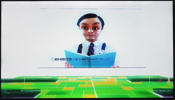
BA: That sense of comfort definitely seems like part of the agenda of the dark forces ruling the world of BHBITB, but maybe it’s also part of the artist’s gambit. Just like the consumer-citizens of Haycraft’s future, the viewers here need to be seduced into the world if they are to appreciate any of the multilayered details we’ve been pulling at. And so: smiling faces, clean design, and glimpses of a familiar future pull us into the story. The video playing on the cereal box you mentioned features a great mini-narrative about a figure (played by Haycraft) exploring the world of BHBITB in a happy-go-lucky manner that feels appropriate for the Saturday morning TV installation it appears in. When was the last time you got to sit back in an armchair and play video games in a gallery?
IMD: Well, that a seductive thing, isn’t it? The invitation to escape into the mystery of a virtual world? Within this game, visitors navigate through a futuristic architectural space to … nowhere. The “game” is a first-person POV trip through mazes and spaces that offer nothing – steps and rooms lead to one dead-end after another. The dead-ends often terminate at a talking head or boldly presented motto, which resembles substance, but are actually empty.
The journey is blank; as more narratively driven POV video games are also. In those games, the progress made is represented by survival and points, but ultimately leads nowhere, even in success. The lack of a points system or adversaries in Meditation Station 1.0 makes the journey sort of Zen. The idea of waking in the morning, pouring a bowl of cereal and starting a video game only to spend hours and days attempting to “win” is a standard cliché of geek culture. In the moment, the game functions to give structure to time, which is at once vacuous and meditative.
This piece inspires the question: “Is playing a video game a ritual or habit, and what is the distinction?” For instance, is buying “Starbucks” every day a habit, a ritual or a lifestyle choice? Haycraft’s overall presentation plays into our confusion about what any of what these terms really mean. I’m interested in the way ritual and meditation are presented elsewhere in the exhibition…
BA: Those are definitely some of the key ingredients in Haycraft’s work. The huge library of objects, videos, and ephemera related to BHBTIB (there’s website too!) covers so many big concepts that it seems likely to just encompass all of our earthly concerns and become its own world. Which, I think is Haycraft’s endgame, and why the work is so much fun to explore—you never once get the sense that you’ve reached the limits of his imagination. That said, when the artwork takes on so many big ideas it risks becoming a scattershot mixture of smaller projects.
For example, there is a giant caricature of religion in the back of the gallery: a thin black pillar that bows mechanically while staring ahead with a single glowing eye (Daily Devotions, 2014, wood, plastic, acrylic, paint, enamel). True BHBITB fans will hopefully discover an elevator in the video game that leads you to a giant pulsing chamber filled with countless digital versions of this character. While this generic riff on religion is a bit heavy-handed, BHBITB is a satire of the modern world and its inhabitants occasionally verge on the cartoonish.
IMD: Our conversation returns to satire… This seems like a good moment to mention the debts BHBITB owes to earlier parody religious movements like The Church of the Flying Spaghetti Monster and The Church of the Subgenius. While the first (a.k.a. Pastafarianism) worships an absurd deity made of noodles and meatballs to illustrate the manipulative ways organized religions generate and influence followers, the second is a more explicit social satire presented with the language of religious philosophy.
Symbolized by the more grounded godhead “J. ‘Bob’ Dobbs”, a floating head smiling pipe-smoking 1950’s-style father-image, Subgenius promoted an ironic dissection of American conservative social, moral and financial mores as an attack on American politics of the time (i.e. Reaganism). BHBITB fuses the strongest elements of each while rejecting their more acerbic flavors. Haycraft’s project attempts a universal and welcoming tone that the earlier faux-religions did not. BHBITB synthesizes Post-Modern irony with globalist attitudes, IKEA design-sense, Zen-spiritualism and brand loyalty in a way that seeks to appeal to the broadest possible audience.
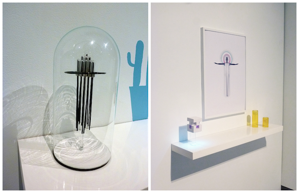
But this all-inclusive quality also works against the overall effect. The iconography of BHBITB is so generic and pleasing that it doesn’t always make a terribly strong impression. Several of the smaller sculptural elements in the exhibition (e.g. Temptation, glass, steel, plastic, enamel, 2014) seem to be intended as devotional objects, but don’t have the same depth or interest of some of the more complex works. But maybe distinctiveness is not the point. Many of the objects and images are repeated throughout the show, creating a conceptual through-line for the entire body of work: that repeating an idea (or image) reinforces its importance even if its meaning or function is ambiguous.
We haven’t mentioned the use of language much here, but the BHBITB message is conveyed several times through mindless texts like a handbook or even an application for the organization. The vocabulary and format of these materials is generic, but also specific in form and presentation. It doesn’t communicate much, but in its confidence and repetition, it comes to resemble content.
Thinking back to the earlier faux-religions, it’s interesting to consider that they each began as small-press pamphlets and books, but later developed into socio-philosophical movements that generated travelling festivals and viral iconography. J. Bob Dobbs (from the Church of the Subgenius) was a major figure on Baltimore’s LOAD OF FUN storefront for years, and there is a Flying Spaghetti Monster sculpture on the side of a building on Falls Road in Hampden.
The BHBITB project seems to aspire to this sort of cultural embrace, but is too cold and generic to ever morph into such a populist entity. In a weird way Haycraft is using commercial language to create something that is so vague and alienating that it could only be art. It’s fascinating to consider—will BHBITB transcend the sphere of the art world and be embraced by a larger audience? I see a lot of potential for that, and it’s an exciting prospect.
Ryan Hoover: “ambi-mimetics”
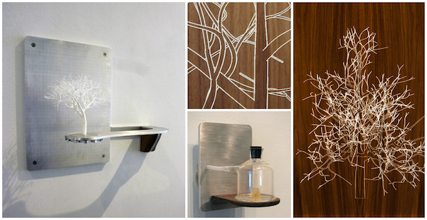
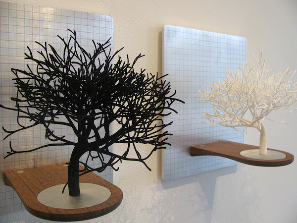
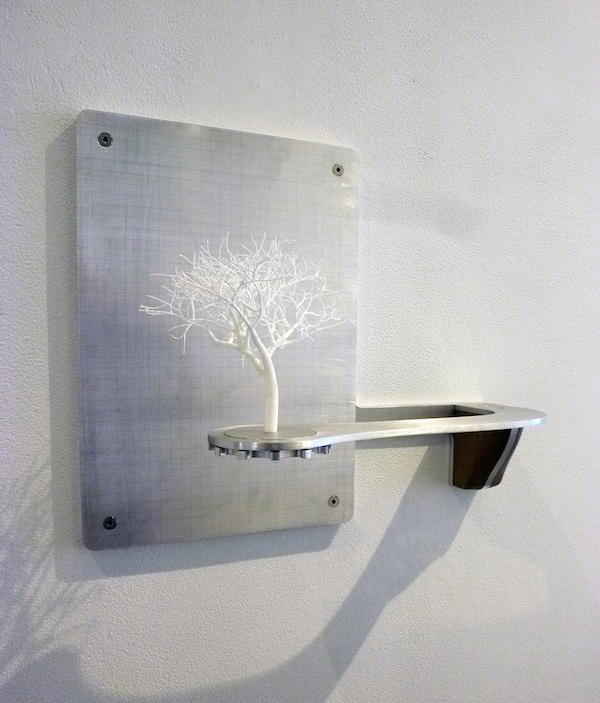
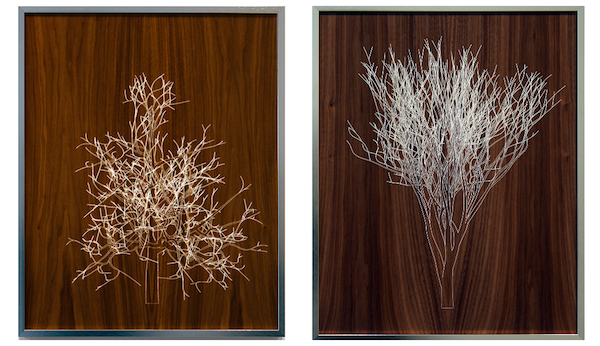
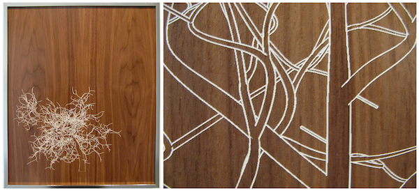
Benjamin Andrew: Judging by the panels and sculptures elsewhere in Hamiltonian, Ryan Hoover is some kind of wizard. Impossibly delicate miniature trees sit on wall-mounted shelves; some black, some white, but all seeming like bonsai artifacts from the future. A series of wooden panels nearby have been intricately painted with images of similar tree structures, white acrylic sitting against luscious wood grain. Tightly shaped aluminum frames the images and supports the sculptures by way of carefully crafted shelves. It all looks like it came out of a high-tech factory, but the work’s relationship to natural imagery and processes suggest something more complicated.
While some artists rely on inspiration, Hoover created a digital algorithm that generates the complex natural forms seen in his work. These forms resemble branching limbs and root structures; alternately etched and painted onto wood panels or 3D printed in Nylon. Despite using digital fabrication, elements of the work are still crafted by hand. Hoover’s technical dexterity is matched by an apparent fluency in writing code, suggesting an artist in full control of physical materials and immaterial systems of growth. It’s as if the artist finally mastered woodworking, and then kept going—in hopes of understanding the very essence of the trees that used to be a material but are now a subject of scientific research.
The same algorithm used to generate the artwork is also being used by a tissue-engineering lab to help develop vascular systems for 3D printed organs. For this exhibition, Hoover even collaborated with a team of citizen scientists at the Baltimore Underground Science Space (BUGSS) to 3D print a simple form out of biological (living plant) material… but is it even art at this point?
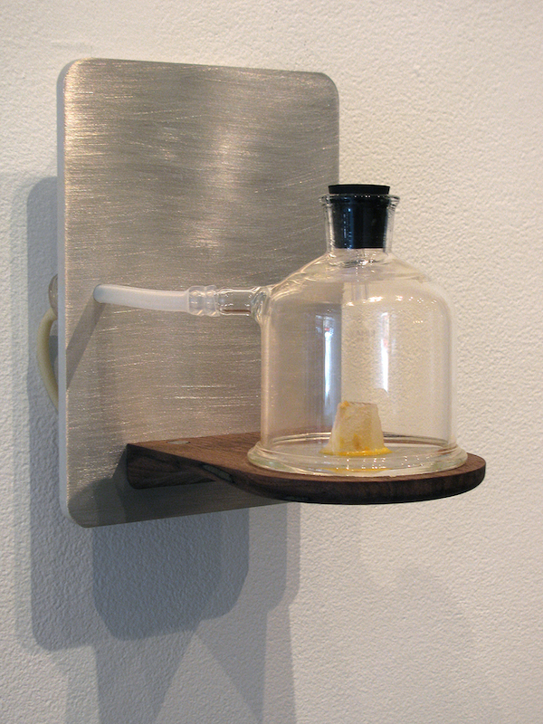
Ian MacLean Davis: I think it’s very funny that you characterize Hoover as a “Wizard,” because I agree, but consider “Alchemist” more appropriate. The plant-matter 3D print (Bio-print I, 2014) is at once the keystone of this exhibition and its outlier. Throughout ambi-mimetics, the drawings and sculptures present the synthesis of nature, technology and art, primarily through illustrations of trees generated by digital tools, but finished and assembled by hand.
In Bio-print I, the form is not legible as natural material, but does read as a specimen, enclosed and presented as it is in a bell jar. It’s the one moment where easily read symbols of nature are released in favor of a purer science. Ultimately, it feels like the most concise representation of Hoover’s core ideas.
The last point you make is a real kicker. It sounds like you’re asking, “At what point does collaboration sacrifice authorship?” Obviously, that’s complicated, but a reasonable way to begin discussing the work. Is it acceptable to sacrifice authorship to a mechanism (or equation)? We know it is. That’s the same as doubting whether collaboration is valid in art making, or if handwork is required. I think we can both agree that Art is collaborative, often in execution and certainly whenever we invite any sort of critique. Having said that, the body of work presented in ambi-mimetics is essentially all paintings and sculptures. Even the 3D-printed plant matter is basically a sculptural object.
BA: It’s true that the algorithm takes some of the creative work out of the artist’s hands. That seems to follow a strong legacy of chance-based work (like John Cage throwing darts at his sheet music) but I’m not very concerned about the artist’s collaboration with a team of coworkers, I think that’s a great way of working. When I suggested it was pushing the boundaries of art, I meant that bioprinting and algorithmic programming seems an awful lot like genuine scientific research. With that in mind, it’s exciting to consider how Hoover has spun what might be typical lab work into aesthetic works for a gallery. Do you think the art adds creative value to the behind-the-scenes experiments, or is the research process itself part of the art?
IMD: Every creative process requires research, whether it’s in the form of understanding process, history, or materials. As artists, we both understand that an individuals’ definitions of research are highly subjective. The creative value in the experiments is the problem solving that leads to the results—in this case, the objects. The creativity is in building the printer, writing the code, and balancing the chemistry. Basically, making sure the mechanisms work. I don’t think that Hoover’s work directly explains the process—it’s not an illustration of the science, but an example of its success. It’s created with these high-tech tools, and those processes still remain mysterious to most audiences. We don’t understand the intricacies of 3D printing or laser carving when we observe the work.
Since it is so exciting to see lab work spun into gallery pieces, I think it’s easy to get wrapped up in these types of discussions. What I’m most interested in is how the work reads aesthetically and if it can be divorced what we’ve been discussing. Does the process get in the way of appreciating the work? How do you feel about the look of these drawings and sculptures?
BA: My favorite detail in Hoover’s work is revealed upon close inspection of his panel paintings. If one looks closely enough, the intricate white lines digitally rendered onto the wood appear slightly pixilated—revealing an effect called aliasing which attempts to draw curves with square pixels. This visible sign of digital technology on the bare wood is a strange sight, and one that could be exploited more if Hoover continues to play with this process. As digital fabrication equipment approaches its limit, we can appreciate the complexity nature’s patterns (something Hoover pays tribute to in his artist statement).
As I’ve said, the work is impeccably crafted; the pictures’ metal frames and the polished wooden shelves all reflect the precision and care that went into making the work. But especially, with the sprawling interactive work by Joshua Haycraft in the same gallery, Hoover’s paintings and sculptures seem very gallery-friendly and polite despite the unusual methods that went into their fabrication. You asked if the process gets in the way of appreciating the work, and I think the process is actually the most fascinating part of the work. What might appear to be simple paintings of trees on wood are actually part of some really challenging scientific research. The fact that the viewer’s window into this process is a 21×17 inch painting might be more telling about how the gallery format affects an artist’s work, but then again maybe the story behind the work is enough to start the conversation and make people take a closer look at their house plants.
Haycraft & Hoover: Conclusions
IMD: It’s interesting that you mention how the gallery space affects the work. In this tandem exhibition, I find both installations are dramatically changed by the work of the other artist and how they are organized in the gallery space. For this show, the gallery is divided by a wall, leaving the front third of the gallery for Hoover and the remainder for Haycraft.
Hoover’s small and consistently sized works get all the sunlight, and the natural light enhances the organic forms and textures in these pieces. Conversely, the partially closed-off space in the rear helps Haycraft’s work feel like its own world. Unfortunately, the sum result of this combination is that Hoover’s installation functionally and visually starts to read as a waiting room for Haycraft’s corporate home/office/meditation space. Hoover’s pieces are so easily read as gallery artwork, particularly against the more ambiguous installations in the BHBITB project, that their presence as saleable objects is magnified in a disconcerting way.
BA: Everything in the show certainly feels mechanically produced; there is little trace of either artists’ hands in the whole gallery. I think both bodies of work are aiming to appear futuristic, either to seem precious and beautiful or to bring that idea of the future into their conversations.
I love how the two artists are approaching the idea of technological progress in their own ways: Haycraft depicts imaginary technology from the future, while Hoover engages with the actual cutting-edge science of today. Scientific inventions have been a driving force in the modern world for a long time, but how can we analyze the value of imaginary inventions and fictions like Haycraft’s work? Science and fiction are both relative new comers to the art gallery, and it’s worth considering their place there.
The algorithm that Hoover uses for making his art might eventually be used to create new organs for a dying patient. His bio-printing process “mimics” (to quote Hoover’s artist statement) natural growth patterns, making it some sort of ultimate aesthetic ability—what could be more beautiful than nature itself? And yet it’s hard to dismiss the value of Haycraft’s fantasy world when its allegorical fiction has so much to offer. In the end it might be a case choosing to closely study nature or escape it altogether.
IMD: As much as we’ve been discussing cutting-edge technology and futuristic imagery in relation to both the artist’s work, each actually rely on established styles which are anything but forward-looking.
One of the most absurd and memorable images from BHBITB is a taxidermied canary in a plastic vitrine, wearing what is essentially a diver’s helmet. While the tools and materials are contemporary, the stylistic language is old-fashioned. With Hoover’s work, the polished wood and metal structures for his sculptures remind me of the dashboard and polished interior handles of automobiles of the 1940’s. The smooth walnut surfaces that his Arborescent Algorithms are inscribed into read both as antique furniture and as pieces of 1970’s wood-paneled domestic space.
But it’s these qualities that make all the works so appealing and comfortable – and effective as delivery of their ideas. Illustrations of the future have always been dressed in the fashion and materials of the past, as a way of making “the new” more familiar and safe. Each of these artists understands how to use our comfort with these recognized styles to convey their ideas in a nearly subliminal way.
Hamiltonian Gallery is located at 1353 U St. NW, Washington, DC 20009. Hours: 12-6pm, Tues-Sat. For more information, call (202) 332-1116 or visit http://www.hamiltoniangallery.com
* Co-Author Benjamin Andrew is an artist and writer currently based in Baltimore. Working with performance, video, and installation (among countless other media) his projects use fictional narratives to create participatory adventures in everyday settings. His work is currently featured in the Spring Solos exhibition at Arlington Art Center.
* Co-Author Ian MacLean Davis is an artist, instructor and writer living and working in Baltimore and its outlaying counties. He exhibits nationally and is collected internationally. He was an Artist Fellow at Hamiltonian Gallery from 2008-2010.