A Walters’ security guard summed it up when describing the ‘staying power’ of this year’s Sondheim finalists. “Visitors stay in certain rooms for a long time and the others, they just pass right through,” he said. The ability of artwork to entrance and keep you in the room definitively pinpoints the success of certain exhibits over others in this year’s competition. However, when a panel of three internationally known jurors will choose the top prize, the ultimate winner is anyone’s guess.
Gabriela Bulisova by Ian MacLean Davis
Gabriela Bulisova’s “Time Zone” is presented in the wall text as a “multimedia presentation,” but really – it’s a documentary film, a movie. It presents the story of Lashonia Etheridge-Bey, an ex-con who spent 18 years in prison for a double-homicide. It’s not the story of her crime as much as her life after prison: the struggle for rehabilitation and the ongoing healing of self and family. The style of the film is a balance of still-image montage and verite film, with awkward hand-held video and straight interview. All of it is used to the effect of directing the audience to feel empathy, if not sympathy, for Lashonia.
The film is elegant and well constructed. The purpose of contemporary “documentary film” is complicated and nebulous. There was a time when audiences trusted this style of film and photos to show truth. We’re largely beyond that those days. This is not a warts-and-all presentation of Lashonia’s life. Very little is offered about her life pre-incarceration. Likewise, viewers meet her children, but are told only sketches of their childhood while she was in prison. Virtually nothing is revealed about the crime that resulted in her imprisonment. This is all to a purpose, keeping the film from becoming a lurid cable TV true-crime segment. It is not meant to inform as much as cause us to feel, but not at the expense of pulpy melodrama. Lashonia’s story is indeed inspiring. She is presented as an example of someone who made grave mistakes, found redemption though faith, and is on a perpetual path of healing through her current actions and resolution with her past.
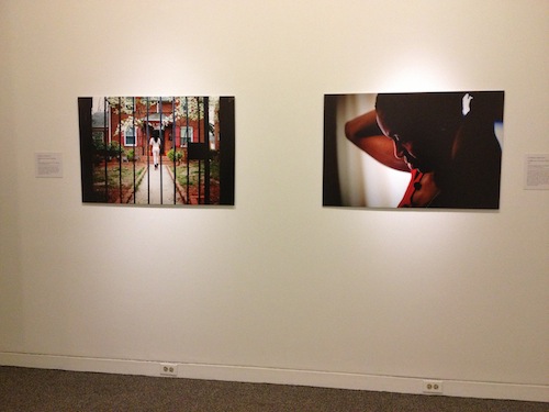
Outside the room where the documentary is projected, a series of stills from the film are hung, with wall-tags that act as captions to explain parts of Bey’s story. These photos are unnecessary if you take the time to watch the 13-minute film. They illustrate the story to visitors who don’t have the time, inclination, or opportunity to sit and watch Bulisova’s video. They do not have the power or purpose of the film, and feel like a compromise created to adapt to a gallery format. Perhaps if the space were curated so that we experienced the series of images and captions, and then found the projection room – the photos would have the function of leading us to the main feature. As shown at The Walters, you’re given the opportunity to watch the film immediately as you enter the Sondheim exhibition. If you choose to not sit in the small viewing room, the photos are there as a fragmented summary of the film, offering little reason to return to the real artwork.
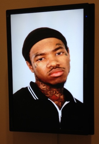
Larry W. Cook by Ian MacLean Davis
Larry Cook’s exhibition is a mix of original video and still photography, edited and manipulated video, and appropriated raw footage. This mix of style and source can be confusing to his message. The work is about perceptions of African-American culture, particularly gang culture. The way viewers are intended to read Cook’s message is muddled: some of the pieces are sharp and succinct while others seem trite by comparison.
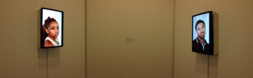
For instance, on one hand there is “Deandre, Aujena, Douglas, Henry.” This installation is presented as a 2-channel video on two flat-screen monitors installed opposite each other, showing life-size head shots of the eponymous subjects, all staring directly into the recording camera and hung at average eye level. The installation space is designed so that viewers stand beside or between the screens, providing the opportunity to make virtual eye contact with the footage. Each subject is young and black, and all have face and neck tattoos, which are presumably gang or prison marks. The point is, these are not people most visitors would make eye contact with, even if we saw them on the street. This piece gives us the extraordinary opportunity to do exactly that and potentially see past our assumptions to the person. In some cases, the barrier is not broken. In one, at the last moment of the loop, Aujena breaks a huge, wonderful smile. This installation is touching and profound, if you take the time to stay with it.
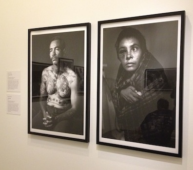
Cook’s still photography doesn’t have the same resonance. “All American” is a series of 3 full-figure portraits of, in sequence: a “Blood,” “Klansman,” and “Crip.” The three figures, dressed in gang costume, are arranged in the order of red, white and blue. The piece is an indictment of these cultures of violence, positioning the power of reconstruction-era racism against the black-on-black violence of the last 30 years. The equalization of these different powers is not unreasonable. However, the stylistic beauty of the photographs undercuts the criticism, posed and photographed in such a way that they could accompany a glossy magazine essay. How to present this sort of content without making it too beautiful is an familiar problem in documentary photography. Nonetheless, the conflict between Cook’s message and the effect of his aesthetics remains something to consider.

Nate Larson by Cara Ober
Nate Larson’s Sondheim installation is a room of smallish photos of contemporary American landscapes. Without reading his wall text, explaining that his deliberately un-monumental photos depict the 75-mile escape route of John Wilkes Booth after he assassinated President Lincoln, they don’t leave much of an impression. Presented in homey, walnut-hued frames and displayed in a cross arrangement on the wall rather than a grid, Larson’s photos of suburban neighborhoods, scrubby woods, and parking lots come off as, well, ordinary.
The photos are technically strong; they are clear, well printed and exposed, but there’s little sense of weather, atmosphere, or mood. Largely, the distance between the viewer and landscape is similar to what you experience from a car window and present a similar level of disengagement. The one exception is a long, person-sized photograph, a close-up of unkempt grass and clover, which adorns the floor in the center of the gallery. Framed the same as the rest, and cordoned off with ropes to prevent visitors from stepping into it, the photo reminds one of a coffin or a burial place. Wall text reveals that it was taken in the approximate spot where Booth was killed.
Without reading the artist’s explanation, it’s difficult to appreciate this project and the relationship between the images. If you do read the wall text, the images make you realize that even the most ordinary places can possess a significant history. Using Lincoln’s assassin as a historical example, Larson illustrates that the secrets of the past are bound up in places that are now, mostly, irrelevant. This work might benefit from a multi-media presentation.

Louie Palu by Cara Ober
For those who saw Louie Palu’s Sondheim Finalist Exhibit in 2011, you will be floored: this exhibit is a zillion times better. Gone are the barrage of timidly framed, small color prints of the war in Afghanistan and, instead, the artist presents just a few large, bold, black and white images of the Mexican drug trade and an intriguing interactive installation. This time around, the photographer has applied his considerable aesthetic skills to the design and experience of his work and, judging from the enthusiastic participation from the audience, his magnetic do-it-yourself blackboard of changing images is successful on numerous levels.
Although Palu presents a well-curated batch of dramatic, iconic images with a healthy respect for the human subjects in his photos, documentary photography can generally be predictable. Here, Palu’s images are intimate and touching, but also present the sensationalized images of marginalized people, dead bodies, and paraphernalia: the detritus of the drug trade. If you read news magazines, you’ve seen these images before. However, judging from the reaction of people in the gallery, Palu’s interactive installation is a big success because it creates a unique relationship between his images the the viewer.
Presenting his fine art photos in a newspaper format, on a newsstand, makes them welcoming and familiar in a formal gallery setting. Everyone who walked through took a paper, unfolded it, and spent time with the images. Most played with the round, black magnets on the ‘blackboard wall’ and spent time moving the photos around and changing them. This simple ‘game’ made Palu’s documentary photography relevant and accessible and encouraged visitors to analyze them from a number of different perspectives. Much more compelling than simply framing images and placing them on the wall, this format acknowledges numerous ways of processing documentary images, both from a private, news magazine perspective and from a collective one, where participants are given the opportunity to share their reactions visually.
Caitlin Cunningham by Cara Ober and Ian MacLean Davis
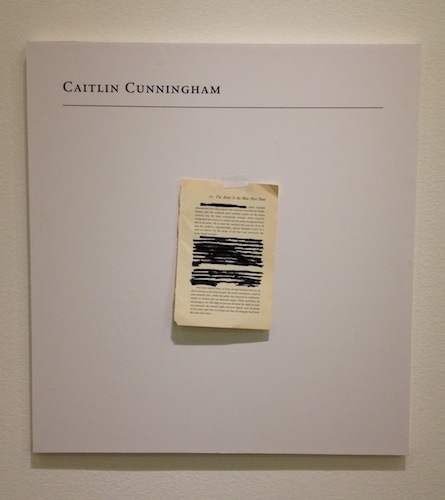
CO: Caitlin Cunningham is a young female artist. Her Sondheim body of work explores the second-class status of women in the art world and history of art. Unlike the other artists in this show, Cunningham eschewed the obligatory gallery wall text – the artist bio and statement intended to introduce viewers to their work. Instead, Cunningham uses this space to present a work of art that may be the strongest piece in her show. Beneath the wall text is a blank plaque with her name at the top and a torn page from an old book taped, hanging askew, in the middle. The top of the page reads “10. The Artist is the Man Next Door” and someone has taken a black marker and hastily scratched out several paragraphs. Without knowing anything about the text (I googled parts of it – can’t find it anywhere), I am left to assume that the page’s title is sufficient to understand the piece. Nearly half the text on the page is crossed out, and women make up roughly half of the population, so we may assume that, like the black cross-outs, the history of art was edited similarly, with all female practitioners erased, leaving us an incomplete and inaccurate image.
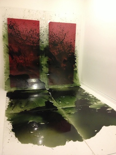
The rest of the work in Cunningham’s exhibit looks professional, but is consistent with the obtuse wall text: most visitors will see book covers and post cards displayed under plexi-glass and the giant, menacing installation of green splashes that references ‘The Shining,’ and then uncomprehendingly move on. Cunningham’s work comes from countless hours of research and exudes a specific and smart, yet inaccessible, trove of information, as if written in a foreign language. Although her artist statement, or lack thereof, is wildly successful as a work of art, Cunningham’s body of work, in this context, would benefit from extending some type of textual olive leaf to the audience, just to include them. On the other hand, her work produces an acute sensation of exclusion, probably similar to what female artists have experienced throughout history, so, in some ways Cunningham astutely recreates the frustrating experience of female artists, and the viewer experiences this profoundly. It’s just too bad that most visitors won’t understand this.
IMD: Cunningham’s work is reflective of much contemporary art in how it willfully exchanges polish and aesthetic pleasure for symbolic self-reference. The title of the large green piece, “Jack(son) Torrance,” is a word game that mocks macho artistry and gives the painting installation most of its content. Jack Torrance is the main character in “The Shining,” played in Stanley Kubrick’s film version by Jack Nicholson. Jackson Pollock is a famously masculine art hero whose method of painting was to drizzle and splash paint onto canvas. These references are consistent with the critiques in Cunningham’s other works. This piece was presented last fall in Gallery Four without the title and material listing, lit dimly and easily passed by, despite its scale and brash quality. Having the opportunity to revisit it here is a pleasure. However, it’s ironic that the most successful piece by the artist without descriptive wall text relies so heavily on tag information to be appreciated.
Dan Steinhilber by Ian MacLean Davis and Cara Ober
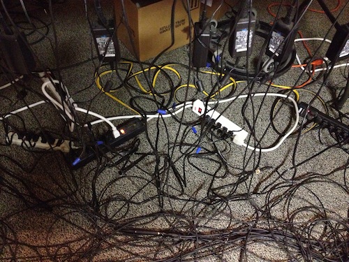
IMD: This installation is consistent with past work in that the artist transforms mundane materials through canny use of technology. However, the visual beauty I expect from Steinhilber is exchanged here for the disarray of a hoarder’s home. The oddly painted gallery is filled with stacks of junk and wires streaming across the floor. To each tacky clock, dented file cabinet, and broken (if not dangerously old) dehumidifier, the artist has attached a small speaker. The speaker plays the sound of that object – either in practical use, like the running motor of a sewing machine, or played like an percussive instrument – a clank, tap or brush. The object is turned into a resonator for the sound of its own physicality. Using ProTools software, the artist has assembled a looping, discordant soundtrack from these sounds.
The noise is mesmerizing, intriguing, and occasionally beautiful. What the nerd in me appreciates about the piece is how he has used the electronics to give junk a purpose, and as a result – a new value. None of the individual pieces would stand on their own; it’s only the ‘orchestra’ playing via the laptop conductor that gives the installation this value. Otherwise, it’s just a mess of stuff and sounds. The technology that allows anyone with an idea to create with these digital tools is as ubiquitous today as the broken appliances and old clocks found in all our basements. It’s not unusual to see unused and dusty landfill crap re-contextualized as art. However, it’s hard to find instances where someone has allowed the materials to maintain that identity – stuff we don’t know how to get rid of – but still become something else that is more than the sum of its parts. The sound fragments Steinhilber created accumulate, assembling into rough music that both reflects and re-defines the contents of the room.
CO: Steinhilber’s installation is a bewildering cat box of an exhibition, but it’s powerful and mesmerizing. The walls are mismatched and full of scuff marks, there’s hundreds of power cords snaking over ugly carpet scraps, and the objects presented are covered in dust. However, the sound is transcendent and oddly fetching. When you investigate the legions of consistently placed speakers and realize they not only blast the sound of the item they are placed on, but use it as a resonating instrument, that’s the moment this piece turns to magic. You can spend hours investigating the nuances of the sound and objects and feel comfortable doing so because Steinhilber has transformed a gallery in the tony Walters Museum into a hoarder’s basement that also happens to exude mellow experimental jazz.
Conclusions
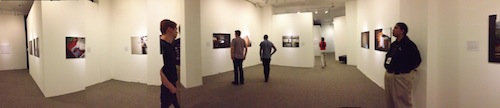
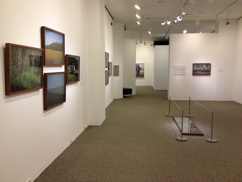
The arrangement of shows in the gallery is unfortunate. All the photography is grouped together, with the two installation artists placed at the end. It would have created a much more balanced and interesting exhibit to space out the sizeable amount of documentary photography present and to create space and contrast between the sculptors. This lack of pacing seems largely to be a limitation of the exhibition space, balanced against the requirements of the artists. As the first instance of a two-year commitment to host the Sondheim Finalist Exhibition, the Walters Art Museum acquits itself well, but the presentation of the work does suffer a bit due to the limitations of the space.